In January 2016, I started working in a team that would take care of our Professional Seller persona. The main project we worked on was about changing the business model in the Cars and Real Estate categories. Before, users could publish as many ads as they wanted for free. With the new model, users would have to pay a fee from their 3rd ad at OLX.
The expected outcome was not only monetary. With this project, we could reduce fraud and duplicated ads in these categories, improving the overall quality of the ads and also reply conversion for the professional sellers of Cars and Real Estate.
Obviously, as the impact on the users would be huge, we took all the caution we possibly could to make sure they understood these new changes.
In this team, I was responsible for gathering insights with the PO, planning and conducting user research, wireframing, creating navigation flows and information architecture specs for the UI designer and developers.
The whole process, summarized:
- In the first weeks, we had many team meetings to set up the new product rules and set overall priorities;
- User testing round 1: we made a very rough prototype based on a current screen to test the concept with users.
- Iteration round 1: with the insights, we changed the messaging and the screen structure, and also refined the task flow.
- User testing round 2: we made a more elaborate prototype and invited more users to a usability test I planned and conducted from beginning to end.
- Iteration round 2: iteration based on the recent insights, also including a demand from the telesales team who needed to be mentioned in this page.
- User testing round 3: we invited more users to test this new layout and also set up a public observation room live streaming the test, as an attempt to spread the UX culture in the company.
- Tying the knots – Pending Pay project: we worked on other improvements necessary for the good functioning of this new business model, such as making payment available in the user account.
Note: all the users recruited were within the Professional Sellers of Real Estate and Cars, who would be impacted by the change.
User testing round 1
Main learnings:
- Users didn’t relate with being called “Professionals” so they thought they landed in the wrong page.
- The screen is too similar to the one they see when inserting a free ad. Should be radically different so they perceive something has changed.
- Reaction to the mandatory ad insertion fee is obviously negative.
- We identified the main questions users had to later write a FAQ.

Iteration round 1
I then proceeded to wireframing the new options for the this page and also refining the flow.
For desktop, we created 3 options to test in the next round, based on external benchmarking and mainly our hypothesis for the rejections during the first round.
Option 1: separate products

Option 2: mix-and-match


Option 3: upselling


User testing round 2
Main learnings:
- Message about the free ad on top of page was being ignored.
- Participants just looked straight to the product blocks.
- Participants hoped to see all the information at once.
- They had many questions about the products being offered.
- Winner version was the one with separate products; mix-and-match was too confusing and up-selling had too many steps.
Iteration round 2
We developed an option that would incorporate everything we learned in the last round.
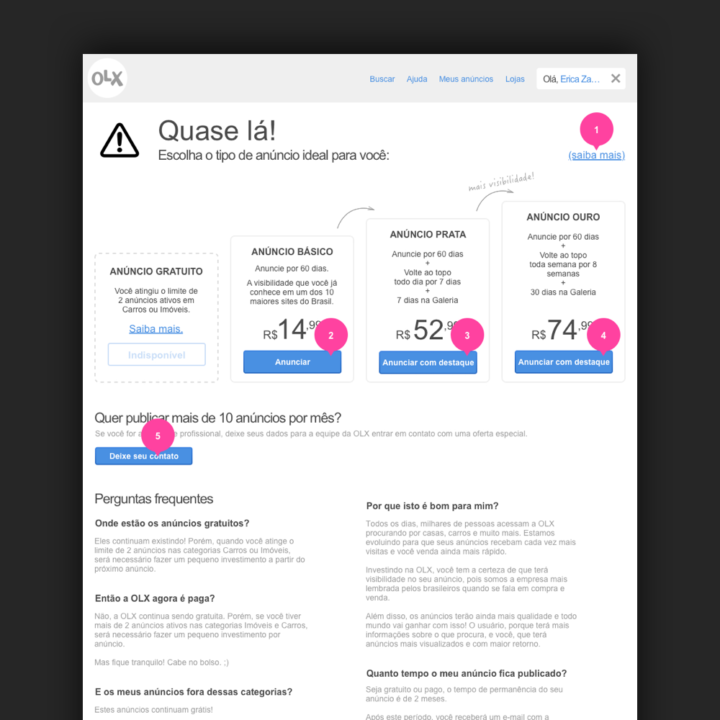
The most interesting insight was to transform the information about “ad limit reached” into a disabled-looking box, side by side with the available products, since it’s where they focused. This version went live on the website without further testing.

Wireframe 
Final layout
Incorporating telesales
A few weeks later, the telesales team asked us to build a version where their product was more visible. They sell special packages to professional listers who publish over 10 ads a month. So we worked on that too, and took two versions to testing.
Version 1 listed only the websales products on top, but dedicated a large area for the telesales team right below, with more detailed information.
Version 2 treated the telesales product in the same level as the websales products, showing less information than version 1 but being immediately visible within the first scroll.

Version 1 
Version 2
User testing round 3
Main learnings:
- Version 2 brought more attention to the telesales product in comparison to version 1
- Benefits weren’t still clear: language change was needed
- The version that was live on the site still had better language than the one we were proposing
- Live-streaming the user test was a big win, even though not as many people as we’d hoped showed up
Pending payments
After finishing this first part of the work, we still had other touchpoints on the website and apps that we had to improve for a good functioning of the new rules. One of them was allowing users to pay for ads later, and not only right after publishing them.
This task was much more technical: we didn’t do user testing, but we had different scenarios to cover. We needed to make it clear for the user with pending payment how they could pay. But we shouldn’t show anything about payment for users who’d never need it (e.g.: other categories apart from Cars and Real Estate). We developed dynamic tabs in the My Account area, and the “pending payment” tab only appears when there’s content to be shown.
Together with the marketing and legal departments, we also standardized the language used on all platforms to reference ad statuses: active, published, pending payment, pending activation etc.
