adidas product comparison
How do we help adidas customers understand the differences between products?
It started as a small project to explain the differences between two types of football jerseys.
Then, it became a mission of getting the right content – for many other product types, and way beyond the digital space.
Backstory – comparing Football Jerseys
In the beginning of 2019, our team was given the challenge to help users understand the difference between our two types of Football Jerseys.
| Authentic Jersey – €130 | Replica Jersey – €90 |
| The one professional players wear on the matches. The fit is slimmer, and the visual details (such as the club’s badge and the 3 stripes) are applied with heat transfer, to make the jersey lighter for the professional player. The material keeps the player’s body cool and dry even in hot weather. | Version made for fans, for lifestyle/streetwear purposes. The fit is wider to provide more comfort, and details such as the badge and 3 stripes are embroidered. The material is also sweat-wicking, but not as much authentic jersey. |
To explain these differences, we set out to design what we called the “Compare Tool”. We tried out a few different designs with user tests, to achieve the one shown here.
The user would see a banner either on the Product Listing Page, or in the Replica Jersey Product Detail Page. Clicking this banner would trigger an overlay to be shown, detailing the differences.

The content challenge
For the content of this tool, we originally aimed to use the same information shown in a section of the PDPs, called “Highlights”. We soon realised that would be challenging, given that the Highlights of both products don’t correspond and are not comparable.


Due to time restrictions and dependencies with other departments, in the end our own UX copywriter wrote the missing product copy (this was a whole other process, with its own challenges). We launched the tool with this hardcoded content. This was far from ideal, but enabled us to launch our MVP to “test the waters”.
Results
Metrics of the AB test:
- 6% of customers who saw the component engaged with it. That was considered good, in comparison to the interaction rates of other components on the PLP and PDP.
- Of those 6%, 18% added to bag. However, this result was considered flat, because the traffic was so low it didn’t move the needle overall.
Behaviors observed in Decibel (screen recording tool):
- People still opened the PDPs to check the larger images
- People tried to click the whole banner (images and title) instead of the “Compare” button
- People even added the products to their bag, but went back to PDPs to add the player’s name.
This implementation of product comparison was also mentioned on football website Footy Headlines.
Next steps
The project had potential, but also needed some improvements. We needed to address the behaviors observed. From a UX/UI perspective, ideally the content should also be more quickly scannable, so users understand in a glance.
But most importantly, we needed to find a way to handle the content better, since our current implementation was not scalable. Our vision was to fetch content in an automated way, so that we could also compare other types of products, especially the performance ones.
A new approach
Towards the end of the year, we were asked by the Running business unit if we could use the “Compare Tool” for Running Shoes as well. There was a new focus for the company on improving the technical Running experience (another project our team worked on), and part of it was about explaining the differences between the Running Shoes.
The bigger difference here is that, in theory, you could compare any running shoe to each other, while on the Football Jerseys you would always compare them in pre-defined pairs. Also, this was a much more technical product than the Jerseys.
Almost at the same time, the Training business unit wanted to use it to compare Sports Bras, as there was a big company initiative for becoming a better brand for women. And soon after, the Football BU came back again to ask about comparing not only Football Jerseys (in preparation for Euro2020 and other championships), but also Football Boots.
Our vision
We aimed to make a scalable project, that:
- could be applicable to most product categories
- fetched content automatically
- showed information users really care about, in the way they communicate about it
- established a work process we could do with any Business Unit
The process described below was done for all these categories at about the same time. I’ll describe them a linear way for the sake of clarity, but the reality was much messier than that! On the bright side:
- working on multiple categories at the same time made sure we were establishing a scalable, universal process, without getting too trapped in what one specific category needed.
- the work on one product category informed the other ones. I could experiment approaches, processes and even designs on one category and iterate on the next one.
Then it was time to roll up our sleeves and start the work. I think of the work in 4 parts:
- Content – what is the right information to display about each product, and how to get it?
- Placement – where in the user journey is the right place to compare products, and how?
- Product relevance – which products should we suggest for the user to compare?
- Interface – how can we make the information easy to read and to interact with?
Again, the work on these 4 fronts happened simultaneously, and influenced each other, but will be further described separately.
Getting the right content
One of the main aspects of comparing products, regardless of how it’s rendered on the interface, is to get relevant and easy to understand information about the products.
On the previous test for Jerseys, the information was insightful but not necessarily easy to compare in a glance. Also, the images available didn’t necessarily reflect the characteristics we wanted to explain.
Can we use existing content?
The first step I took was checking if we had enough content already, to be fetched in an automated way. There is a team on adidas digital department which takes care of the Product Information Management, and I’ve asked for their help requesting all attributes we had for Running Shoes. The same work was done later for Sports Bras.
I received a spreadsheet which contained some product attributes, and also the copy that shows on the PDP, in the following sections: Highlights, Description and Specifications.

It turned out that most of the really important details were present only on the bullet points on the Specification section. I manually broke apart the information of all those fields and categorised them on this Excel sheet to understand if they could be reused. (Excel sheet is confidential and can’t be shown here.)
I discovered that the content was not written in a consistent way. For example:
| Product A | Product B | |
| Specs. bullet 1 | Talks about fit | Talks about closure (laces) |
| Specs. bullet 2 | Talks about closure (laces) | Talks about the material of the upper AND the lining |
| Specs. bullet 3 | Talks about the material of the upper of the shoe | Talks about the outsole materials |
That means that not even if we found an automated way to break apart the existing content, we would still need to categorise what the information was about. To make it worse, the content is not always written using the same kind of language or level of detail. So the team decided that we would have to fix the information higher up in the chain, in the source.

Fixing the data from the source
We set out on the mission to collaborate with the stakeholders in the different business units, by making proposals of the attributes we needed tagged to enable our various digital tools. To put in perspective, these are some of the projects in our roadmaps that would benefit from a solid and consistent data structure:

What do people want to know about the products?
To make sure we make the right proposals, we needed to be very certain of the information users were looking for, in the different product categories. I consulted our user research library and found several sources for overall product evaluation and comparison, as well as specific insights for each of the four product categories we were working with. There was also a research specifically for Running, which was briefed by our team for this project (as well as another one we were working one for Running).
I then documented the research insights, and specific rationale for each category on our Confluence page. Where the research results were not specific enough, I also consulted expert material online. For example, for Football Boots, a video by a big football website explaining how to find your perfect boots. Or for Running shoes, videos and articles explaining how your foot type relates to your pronation and the kind of shoe you will need.
Full content is confidential. See some snippets here:


How to get buy-in
To get buy-in from the business units, I presented mock-ups of the comparison tool with the respective rationale. Our colleagues at the different information management systems also collaborated with their own notes on Confluence.


Product comparison in the right place
Overall flow
Right at the beginning, I created an overall flow of how product comparison could work in the user journey. These were not final designs, not even a final direction, but rather something I put together with the adidas design language library – just visual enough to get a broad understanding and to start the conversations with the team. The broad idea was:
- The PLPs (listing page) are the moment where the user starts noticing the products they’re interested in and also the similar ones. A common behavior observed by our research teams is that they open several tabs with the products at this point. → here we should let the user select the products they want to compare and save them somewhere
- The PDP (product detail page) is where the user is more detail-oriented and has already learned a bit about the chosen product. → at this point we can already provide more detail, and compare other products to the one he/she is currently viewing
- We could even start already showing the first rows of the chart, and expand more if the user engages with the component.
- We could also retrieved the products they’ve selected on the previous page, anticipating their need to go back to them.
- If they landed straight on the PDP, or haven’t selected products before, we can show our own suggestion of products based on the main topics we know they might care about (from user research).

Refining scope with the team
We had a kick-off with our cross-functional agile team. I presented the broad flow above and we discussed where to focus our efforts for the MVP.
We decided to start by making this comparison chart only in the PDP (product detail page) at first. The reasons were:
- Letting the user select the products would create very complex flows for both UX and Dev at the moment.
- There were other similar workstreams on the roadmap for the PLP (listing page), such as a product finder.
- There could potentially be other ways to compare products in the PLP, such as enhancing the product cards with contextual information.
We also decided to not let the users add the product to their bag straight from the comparison chart (as we had in our first A/B test for jerseys), because:
- It would need to integrate with a lot of APIs that handle the price, size availability, handling errors.
- In the case of sports bras, size guidance is also needed before selecting a size to add to bag.
- From Decibel we saw that people usually went to the PDPs anyway, to see the images larger and in more detail.

Read below in this article what we discovered about these decisions on the two user tests we did so far!
Comparing the right products
As said, we decided that at first adidas will be the one suggesting products to compare, instead of letting the user do so.
That means we have to define different grouping criteria for each product category, and that can affect even how do we measure success. Some examples would be:
| Product category | Grouping criteria | Success means… |
| Football boots | Different franchises, with same purpose | Increase add to bag, decrease returns |
| Football boots | Same franchise, different variations (with different price points) | Increasing average order value |
| Sports bras | Products with similar price (within her budget) | Increase add to bag, decrease returns |
| Sports bras | Products with similar style, different price points | Increasing average order value |
What happens next
All of that has to be aligned with the business unit’s respective selling strategies and priorities. We are still to discuss with them as well as our analytics experts about how our approach should be.
Comparing products the right way
Lastly on this post, but definitely happening at the same time as everything else, were the designs per se.
I started with desktop designs because honestly, they were more straightforward. We needed a chart that could display the information. It was important to start this way, even if the company is normally mobile-first, so that I wouldn’t spend time making difficult decisions on the mobile design, when I really needed to have something to talk over with the team and stakeholders, and to experiment with the content.
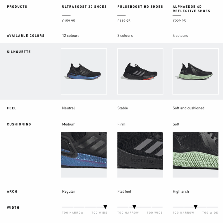
The interesting part of this was to include product information that was not very obvious at first. For example, imagery. Research said that women usually look at the back of the sports bra to better understand the coverage and the support. Similarly, runners look at the side of the midsole to get an idea of the cushioning. The images below shows these two charts after the user has selected to view all the rows.
Another challenge was how to better display the value for money for the different products. This comes represented mainly when we’re showing specific benefits that are not mutually exclusive. In a glance, the user can see, literally, which boxes that product checks.
As a reminder, all the information powering these charts come from the proposals we made to the business units to tag their products.


For the mobile designs, we had a challenge regarding the orientation of the viewport. In a previous size chart project I worked on, we found that flipping the orientation of the table information made more sense to users on mobile, because in that case it enabled them to understand without a lot of scrolling all the needed information. We needed to understand if that was also the case for product comparison, which I’ll explain further, in Lean Test 2.
Validating these ideas
While all these streams were going on, we partnered with our user research team to do two lean user tests (on usertesting.com). We purposefully decided to make the two tests very different in order to cover a lot of ground. After all, the goal was to get insights to guide our decisions, not yet to compare final solutions (which is more suitable for an A/B test).
Lean test 1
The scope of the first test was:
- Desktop
- On the PDP (product detail page)
- Categories: Football Boots and Jerseys. We combined these 2 categories in the same test, since they were aiming for about the same audience.


With this test, we had the following insights (summarised):
Content – the content of both charts exceeded user’s expectations for comparing these types of products, and was considered very helpful.
Placement – users appreciate seeing this tool on the product detail page, but would also expect that this appeared earlier on the journey (on the PLPs – listing pages).
Product relevance – users would have liked to select the products themselves, but are open to adidas’ suggestions at this point. They understand the products offered relate to the product they chose to see.
Interface – the chart is easy to read and conveys a professional-looking look and feel that is adequate to adidas.
Lean test 2
Having learned on the previous test that users expected to compare products all the way from the PLP, for this test we decided to try exactly that. The scope was:
- Mobile (two versions)
- On the PLP (tool triggered by a banner, as in our first ever comparison tool)
- Category: Sports Bras (since Running Shoes would probably be most similar to Football boots, already tested)
This test was especially tricky because, as explained before, we might need to invert the orientation of the chart due to the viewport proportion and size. We tested the two prototypes below with users to get a sense of which direction to go to.
By keeping the table the same as Desktop, we make it closer to what people are already more used to. However, the scrolling interactions are difficult and you can’t see all the information in a glance.
By inverting the table, the format becomes more “unusual”, but possibly easier to read, since you can check the same attribute in 3 products at once.
Here’s what we learned:
Content – the content of the bra charts also exceeded user’s expectations.
Placement – most users didn’t notice the banner to interact with (banner blindness). When prompted to, they said it made sense. However…
Product relevance – … they really didn’t appreciate that the products were chosen for them by adidas. They were suspicious that maybe these were the most expensive products adidas was trying to push, or just disappointed and confused as to why these products were shown when they didn’t correspond to the ones they liked. At this points, we have to be very clear about why these products are there, let them select, or show products they’ve already shown interest in before.
Interface – there was not a very clear preference, but a slight tendency of people preferring the inverted chart and considering it easier to read. On the negative side, the side scrolling might not be notice, which points that we have to improve the affordance for this interaction.
Documenting the journey
Since the very beginning, I started documenting everything on a Confluence page, aiming for transparency with my team and stakeholders, and to keep track of decisions and outcomes on so many different aspects of this project.
Our team realised on previous projects that we needed to work more together to be more efficient. In order to better understand our own design process in such a complex environment, I’m also keeping track of our activities along the weeks of the year on a project log.


What happened?
Unfortunately, I did not stay at adidas to see the end of this exciting project. This was the last one I worked on, before moving to Elsevier.
From what I can tell based on the website, sadly, it seems it did not go ahead. 🙁
What I learned
- Performance products is an exciting universe – however, it can be really difficult for customers to understand the differences between them.
- Getting the right content can be lot more difficult than getting the right design.
- Mobile tables are tricky!